I had promised myself I would take another stab at
Green Over Water. I wasn't entirely happy with the result - the colours were too harsh, and the dark greens were not realistic at all. I haven't had much time lately, but I managed to fit in half an hour here and there, and here is the result - the colours are much more subtle, and I achieved a good dark green by adding a couple of washes of yellow ochre over the vanadium yellow and phthalo blue. It takes the blueness out of the green and looks much more natural I think.
You will notice a few splashes towards the top right - Well, that's what happens when you drop your paint cup! I managed to mop up most of the damage, but there were a couple of spots that got enough time to dry!

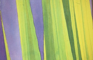
And here is a detail that shows the different shades you can achieve by layering 3 colours. The trick is to not mix the colours on the palette, but to apply them glaze after glaze, patiently waiting for each layer to dry.

 And here is a detail that shows the different shades you can achieve by layering 3 colours. The trick is to not mix the colours on the palette, but to apply them glaze after glaze, patiently waiting for each layer to dry.
No comments:
Post a Comment