Monday, February 29, 2016

Haze

One of the aspects of Alvaro Castagnet's paintings that I like a lot is the sense of haze that he creates in his street scenes and kitchen action paintings. As per my previous rant, you will find nothing in his book that actually explains how he achieves that soft steamy smoky effect.

So I decided to explore myself, creating an imagined industrial landscape in my watercolour sketchbook. First  I applied Chinese White watercolour, as mentioned in Mr. Castagnet's book. Didn't like it. It partly lifted the original colour. And it was dull and dirty-looking. I tried to spray some water onto it and lift colour. It looked even worse - like water after you've washed the dishes. Not pleasant. At that stage, I had nothing to lose, so I picked up my pastel set and applied a few dashes of colour and a thin film of white, which I rubbed slightly into the paper so the strokes wouldn't be as obvious. Then I sprayed pastel fixative over it. It no longer is a pure watercolour, but I quite like the result. I might try to use that in my current project.


Sunday, February 28, 2016

What I'm wearing today - 28 February 2016


Quick quick post. Lots of things still to do - study Japanese, do the laundry. But I decided to give priority to drawing today, because I felt I was on a slippery slope - I haven't done any serious drawing in a week. And doubts can creep in.

So, I decided to revive one of my old blog categories - What I'm wearing today - with a twist. 

What does K.I.S.S. mean, you may ask. Keep It Simple, Stupdid (something I learned in Sketchbook Skool today)

K.I.S.S. is a great excuse for not drawing my eyes, nose and chin - all difficult features. It works for me.


Saturday, February 27, 2016

Castagnet - Watercolour Masterclass - Understanding the four pillars of watercolour


I bought this book after reading a short article by Alvaro Castagnet in an art magazine.  It sounded like the book would help me take my watercolour painting to a new level.

And if they had asked the painter to write an article in this respected magazine, surely the book had to be good.

Well, I am an innocent maybe. But nowhere did it say this article was an advertorial.

The bottom line? Don't buy this book, unless you just want to look at beautiful photographs of watercolours. It will not do what it says on the tin.

Actually, it will teach you nothing. I thought that the step-by-step section would reveal some of the secrets of Castagnet's beautiful paintings. But no, nothing, rien, nada.

Just bullshit about how important colour, shapes, value and edges are in watercolour paintings. As if we didn't know already! But nothing in HOW to do it.

Nowhere in this book will you find how he achieves this hazy luminous effect - he vaguely talks about Chinese White, a spritz of water and some towel, but nothing that made any sense when I tried to put it into practise.

And his paintings are beautiful, there is no denying it. But the book cost me over €45 with shipping and I learned nothing that I can use. And the other annoying thing is that he uses the book to advertise his Daniel Smith paints, his paint brushes and his watercolour sketchbooks. And don't get me going on the passion and the emotions!

And to top it all - it wasn't available on Amazon, so I can't write my review there!

Friday, February 26, 2016

Mug


I've completed Andrea Joseph's class on Sketchbook Skool. And I will definitely try out more button drawings and biro drawings.

But for now, I have moved on to Liz Steel's class - Liz Steel is an Australian sketchbook artist and her two big things are cups of tea and buildings. So, I've just completed the first assignment, which I loved. Rather than jumping straight in, she recommends you hold the cup in your hand, feel it, then explore all its features, its overall shape, the details, how they all fit together. When you're done exploring, you're ready to draw and colour without having to think out every detail again.

Things that worked well for me (very different from Brenda Swenson's approach - both work, but create a very different look - I must try this mug in the Brenda Swenson style - to be added to the ToDo list):
  1. Using a light-coloured watercolour pencil to do a basic shape drawing, including vertical middle line
  2. Drawing with a water-resistant pen (uni-ball)
  3. Going lighter on the shadows 

I'm rather pleased with how this mug turned out. It's my favourite mug. It was a Christmas present from my sister-in-law (my Irish sister-in-law, that is). It's part of a set of 4 in similar patterns, with different colours. Each one has a name. This one is called VĂ©ronique. I only use it for special occasions, as I don't want to break it. And I was reluctant to paint it, as the patterns looked too intimidating. But following Liz Steel's approach, I was ready to tackle it.

On the left side below, you can see how I explored my subject.


Next assignment is a building. I'm procrastinating.

Thursday, February 25, 2016

Three colours

I did a class with Shari Blaukopf in Craftsy.com a few months back. And I really enjoyed her approach to watercolour sketching. Skies in particular. So I'm now following her blog and I found this lovely watercolour winter sketch she did with just three colours, raw sienna, burnt sienna and indanthrene blue. I tried to copy it and here is how it turned out. Will definitely use those colours again.

Stage 1 - colours, sky and land:

Stage 2: added trees and details: 


Wednesday, February 24, 2016

Tree in the evening


This is actually two trees. At a certain angle, it looks like one tree. And I will definitely paint them some day soon. I will need to find the patience to paint all those tiny branches, though. Right now, I need something simple, to loosen up my watercolour techniques, after these roses I've been busy with lately. 

Don't you love the light at this time of the year? I should get out more at sunrise and sunset, armed with my camera, and build up a library of skies and trees to paint. But sleep and life seem to get in the way.

And have you noticed how the buds are about to pop on some trees already? Spring is definitely the best time of year in Ireland. So much hope ahead. Hope for the cherry blossoms, the daffodils, the tulips, hope for a good year, for a warm summer, for even just two weeks of sunshine and teeshirt weather. Hope for a dry autumn and a crisp winter. Until we start all over again! Well done everyone (I still have The Dance of the Cherry Trees in my head, sorry.)


Tuesday, February 23, 2016

Buttons

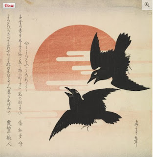
(Ignore the text above the drawing - I was at a funeral that day and the priest was talking about the seasons of life and said the decease was in "the autumn of her life" - she was 91, so it got me thinking)

Inspired by my muses, I went ahead and drew a small sample of my button collection. Most of the buttons I have in my box are from Boden clothes that I bought over the years. But don't ask me to match any of them to their parent top or cardigan. And the irony is that if I had been organised, I could have kept track, as each button came in a little Boden paper bag, on which I could have written the name of the outfit. But life is too short for being that organised, even for me. And anyway, I took a lot of them out of their bag over the years, so I could see the buttons instead. I wonder would a jar be better than a box? So I could see them at a glance.

Do you have a button collection? Do most women have a button collection? What about men living on their own - do they have a button collection? Do children still play with buttons? These are important questions. And I'm not on any drugs or alcohol even. But some days I ponder the meaning of the universe. While most people turn to philosophy (I did read Sophie's World) or religion (I haven't read the Bible - but we had Religion in primary school and secondary school), right now, I'm thinking buttons.

They do hold the key to a lot of our emotions, buttons, don't they? For me, it's afternoons spent at my Granny's kitchen table (the Knitting Granny), going through her button box (one of these sewing boxes that opens like a toolbox), organising the buttons - mostly in rows. I can't remember if I organised them by size or colour (probably both, I'm a very organised person), but I remember long sinuous rows, snaking around the table.

I also remember playing with her old sewing machine, one with a big pedal that you had to press in rhythm to activate the wheel that made it work. She did have electricity in the house - my grand-father was an electrician and they were amongst the first on our street to have a colour television. But I'm not sure she ever had an electric sewing machine. She was more of a knitter than a sewer (although I do remember a beautiful strawberry red velvet dress she made from fabric my god-mother had bought for me. I must ask my mother if she still has it. I wouldn't be surprised.)

We didn't have iPhones in those days. And yes we got bored sometimes, but buttons were always there for rainy days. And the sewing machine.

So there you go - Thank you for the buttons.

Monday, February 22, 2016

Chester Beatty Library

I went to the Chester Beatty Library yesterday. It's not a place I visit often. Actually, I think the last time I was there was in 2007 for a special exhibiton of Yoshitoshi's works, One Hundred Aspects of the Moon.

I was recently given the gift of a Plus One membership to the CBL, so I'm looking forward to discovering this beautiful place and all its treasures

What I did yesterday was a bit mad (Are you surprised?). As you know, I'm studying a bit of Japanese. Progress is slow. Memory is not so good. So I decided to join a Japanese language tour of the museum, organised by the Embassy of Japan - to sharpen my ear!

Well, I was very brave. It was a small group. A few Japanese people, an Irish gentleman who's been studying Japanese for the last 7 years and a German student who's been doing Japanese in university for the last three years. There was a lot of nodding during the tour. I didn't nod much!

You know how it is that any language you don't speak sounds really fast? Well, the guide, a lady by the name of Hiromi Anzai, spoke at warp speed! I think I understood about one word in a thousand! I stuck at it for about an hour, and then I bowed out, missing out on the free tea/coffee after the tour, and the possibility of making contact with Japanese people living here in Ireland. But I got the feeling there was at least another hour before the tour would be done, and my brain was fried at that stage. But I won't let that put me off! There is another tour on the 13th of March, and the 10th of April. I'd better start studying!

PS: the image I chose from the CBL website is entitled Crows and Rising Sun, by Gakutei

Sunday, February 21, 2016

Saturday, February 20, 2016

Jugs


An exercise that was offered last Monday - distorted cylindrical objects. Just what I needed! As you know, I've been struggling with this old jug I've been trying to draw. The advice I was given was to use the vertical lines of the cylinder inside and outside the object and to carve the object from it, just like a sculpture.  Easier said than done, as evidenced by these three exhibits. And I'm pulled between all these different techniques: continual contour drawing directly with a pen (no erasing!) versus soft lines everywhere that show the process as much as the end result. Some day, out of all of this, my own style will emerge. But I'm a slow learner.

Friday, February 19, 2016

Sally Gap


Video by BB. Music by the Chieftains. You may get a message saying that this video is restricted from playback. Click on the link to Watch on YouTube.

Another rose - nearly there


I think that all that's left to do is darken my background a bit. And hopefully not ruin it all! 

Since taking this picture, I've erased some of the pencil under-drawing. Some won't come off, though, as it is protected by the watercolour paint. But I've read somewhere that pencil marks are acceptable in watercolours, so there you go. But I should really draw with a lighter hand next time!

Ok, now I've added more indigo and quinacridone red to the background, and erased all the lines that I could. And that's it. I'm done with roses. (PS: no sunshine today, so the photo looks a lot cooler than yesterday - I think the original is a touch warmer than this)


Thursday, February 18, 2016

DLP 2016 - a few sample pages


I'm sticking to the Documented Life Project, but not really following the challenges and prompts, I have to admit. Some weeks I'll do a good bit, others not much. The element I've enjoyed the most so far are the big black labels. They have really inspired me. They filled me with the need to write in a stream of consciousness. Don't read too much into them. 

I also loved colouring the satin ribbons!

By the way, for those of you who don't know the Documented Life Project, it's an art journaling idea that 5 (or was it 4?)American artists came up with, by which you combine keeping a journal and creating mixed media visuals. I discovered DLP in 2014 I think, and I was going through a bit of a dry patch in terms of creativity and I found it helped me go back to my roots and enjoy art for art's sake, without worrying about my drawing skills or actually creating a piece of art. Just play with colour, collage and Gelli printing. It was exactly what I needed. Right now, I've got plenty other art adventures going on, so not as much time for DLP. But it's still there as a comfort blanket when I need it. And it is lovely to go back over pages I created in the last two years (which of course you will find in this blog, by locating and clicking on the label "Documented Life Project" in the right-hand column or by typing in Documented Life Project in the search bar at the top left of my blog).

Here are a few sample pages and elements from recent weeks:


I'm struggling a bit with the week pages. But I liked the colours I picked for this one:


Wednesday, February 17, 2016

Stones

Crows, stones. I think they are all pointing to my love of Irish beaches. The first thing I'll do when I can drive again is drive to Killiney beach and sit in the car and draw and paint!


At first, I thought "Pick a pen, any pen, and draw" - that's it? that's all Andrea Joseph has to teach us? But as I worked through her assignments in Sketchbook Skool, I finally got it. How cross-hatching with a biro can be so soft, how you can build layers that blend into each previous layer, without looking heavy. How this pen or that pen is not going to make you an artist. How drawings build themselves up organically. 

And I've already started a button collection drawing. Inspired by Bake-A-Yarn and Andrea Joseph. Muses can appear in any guise!

At this point, my only regret is that there is nobody left in this Sketchbook Skool class to chat with. That's what happens when you buy more than one Kourse at a time (I bought three last September - I did Beginning, this one is Seeing and the next one I have is Storytelling) - everybody else is gone. 

There is an eerie end-of-the-world feeling about it. But this is the internet, so my thoughts and words will probably be discovered by an archeologist or an anthropologist in a few hundred years' time! And that happy thought keeps me going! Plus, I'm posting the same drawings here on my blog, and Twitter, and Google Plus and Pinterest, so at least 30 people will see them (my blog stats were much better when I was posting screen shots of Jean Byrne and other female weather forecasters. Strange that, or a sad commentary on celebrity and leather dresses!). That's not bad. Why not Facebook, you ask? Well, I don't want to drown my friends and family in my daily musings, so I only post my best pieces there. And if they want to know what I'm really up to, they can check this blog whenever they want to - few ever do. You're different. You come here by choice. Thank you.

I think blue is my favourite colour now, Ă  propos of nothing. Though I rarely wear it or paint it.

Oh, and forgot to say that Stones is also the title of an old Neil Diamond song!


Tuesday, February 16, 2016

Biro

I was moaning (in my own head - nobody else listening) about the lack of guidance for this Sketchbook Skool assignment - it was basically "draw with a biro". I wasn't very inspired. So I picked a boring old pot holder - is that the word in English? Cache pot in French. And I was muttering to myself the whole time I was drawing this (Let's blame it on premature old age). But then, I looked at the shading (and I'm not good at this cross-hatching business), and I was there "Oh, that's not bad". Now, I know this drawing is far from perfect - I am not completely blind, thankfully, although I am eternally optimistic when it comes to my art output. All I mean really is that I see something interesting in it and I think I will explore this biro drawing technique in future.

One piece of advice from Andrea Joseph that spoke to me is to go really soft with the pen when hatching and cross-hatching, and layer and layer, rather than press hard on the paper. Someone says that you should be happy if you get one really good recipe out of a cook-book. Maybe the same is true with art courses - one good tip is all you need. As long as you actually remember to practise it.


Monday, February 15, 2016

Killiney beach


We don't go to Killiney beach as often as we used to. Any time we've looked to go recently, the tides have been wrong (we like to go at low tide, as the beach is easier to walk on). And it was too wet all through the Christmas holidays.

This was towards the end of December, maybe the 29th or 30th? 

This is probably the first place I'll go to when I can drive again!

Painting trees

Another assignment from the same teacher in Sketchbook Skool. She painted a beautiful watercolour view of her backyard in the woods, and it looked so easy. Maybe I'll go back and have another look at her video to see if she actually explains any technique that I've missed, because I found it so hard.

The one lesson I learned from it is to keep items in the distance bluer and lighter, so that's something I guess.

But I wasn't happy at all with my first attempt, so I had to have another go!

Attempt 1

Attempt 2

Sunday, February 14, 2016

Showers

Sunday morning - February
Big Skies
I want to paint it all


Another Rose

By pure chance, this subject is perfectly appropriate for Valentine's Day!

My previous rose was painted on rough watercolour paper.

For this one, I decided to try out hot-press paper - a new challenge for me! The paint reacts completely differently on this paper. So this one will be strictly for experimentation!

This was my first attempt. The paint got all blocky and uneven, so I abandoned it.

This is my second attempt. I read somewhere that hot-press paper will work better if you work wet in wet. So, I'm working section by section, wetting each in turn and painting it. It feels a bit like painting by numbers, and it's a VERY slow process. But worth exploring further, I believe.

A week on, I've completed a few more sections. Slowly getting there. The colours look completely different simply because I photographed it under different light conditions. The truth is somewhere in the middle, I guess. Hopefully I'll be all done in another week. Or longer if I decide to explore glazing to give it more of a pop (but it could also ruin it all - it's always a hard decision - when to stop)

This one is a completely different attempt, using a light wash of colours before actually painting the rose itself. But then it became too much of a mish-mash of colours. It's very three-dimensional, which I'm happy with, but the brushstrokes show too much for my liking. Plus I've read somewhere that Opera Rose is not lightfast, which is a real shame, because it's a beautiful vibrant colour.
I think that by the time I'm finished with this rose, I'll be ready to move to a completely different subject. I'm thinking big skies and nothing else!


Saturday, February 13, 2016

For the birds

Another Sketchbook Skool assignment - I didn't particularly like this class. I didn't feel the teacher covered the brief very well. Some of the teachers just show us their sketchbooks, their art supplies, and then do a quick drawing, and they call that a lesson, which is a bit frustrating. Plus I'm not that interested in birds. I drew these from old photographs we had taken a few years back.  The crows were photographed at Bray seafront, always a good spot - they are attracted by the presence of fish and chips establishments on the promenade. The other bird, I honestly can't say I remember where or when that photograph was taken, and my pencil drawing will not help in identifying what it is.


Friday, February 12, 2016

Vase, orange and pear


Now this one turned out better, didn't it? This time I chose a colourful vase, one that used to belong to my grand-mother, not the knitting one, my other grand-mother, who died when I was six, and whom I don't remember very well, except that one Saint Nicolas she gave me the most beautiful ballerina doll I had ever seen, with blond hair, a pink tutu and a pink crown (which served to control her movements). She came with a little record that you could play, and she used to dance to the Nutcracker suite theme - a twist of her crown would send her in the most delightful pirouettes. I'm sure she had other moves too, but I was not even six, so I don't remember much. I do know that she lost a leg eventually (the doll, not my grand-mother) and she ended her days wearing a cream satin dressing gown made by my mother or my (knitting) grand-mother. To this day, when I hear the Nutcracker suite, I can't help bringing my arms up in a crown and twirling like a six-year-old. I still remember one of my engineers in IBM. He was Russian and the ringtone on his phone was... you guessed it! And yes, one day, I couldn't resist, I did my twirl. It didn't seem to affect our working relationship.

So back to the vase. I decided to add a pear and an orange to both contrast and complement, and I'm rather pleased with the result.

Other lessons learned from this class with Brenda Swenson on Sketchbook Skool:

  1. Use watersoluble ink. It will blend in beautifully with your watercolour.
  2. When applying the watercolour, start at the top, with the paper on a slight incline, so the colour slips down (but not too fast).
  3. Keep highlights unpainted so they pop.
  4. Frame your drawing on the page. The drawing will come forward instantly.
  5. Touch colours with colour from the adjacent object.
  6. Drop a tiny bit of the object's colour in its shadow.
  7. Maybe make the shadow lighter - it's a bit too blocky here.
  8. Make sure to be consistent in terms of expressing where the light is coming from.
  9. Don't worry if some colours bleed from one element to the next. It will add to the painting. But if it's too liquid, use a thirsty brush to pick up the excess.

And here is the original drawing, with my Manuscript calligraphy pen and red ink:


Thursday, February 11, 2016

Continual Contour and Watercolour


The final result of this continual contour drawing is a bit sketchy and wobbly, but then, it's a Sketchbook class I'm doing after all, not learning how to paint a frameable masterpiece.

I love how the red ink blended in with the watercolour paint. How the colour from the pear bled into the jar (intentionally). And how adding a touch of the object's colour to the shadow makes it more vibrant.

The one thing I don't like (I didn't say the only thing, mind) is that the objects I chose for this still life were a bit dull, in terms of shapes and colours.

Do we have time for one more?

Wednesday, February 10, 2016

Beautiful light

I was walking back from the dentist last week, and the sun finally peeped out. So handy to have an iPhone for those days! I will have to paint this scene in one way or another. Not sure how yet. Will I sketch it with my new and lovely Pentel brush pen? Will I paint a pen and watercolour scene from the technique I learned on Craftsy a few months ago Painting Landscape in pen, ink and watercolour, by Shari Blaukopf. Will I go for a full-blown watercolour? And which photograph to pick as the scene of choice? My heart is telling me the first or the second, but there is interesting detail in three and four.

One thing is for sure. I mustn't leave it too long before I start with it, or my enthusiasm will wane, and nothing will get done.


Tuesday, February 09, 2016

Invisalign - last day

It's been a while - 15 months and a few days to be - somewhat - precise (that's where you know I'm not Asperger's - I actually don't know the exact number of days since the 3rd of November 2014).

But I've finally reached the final day of my Invisalign!

It was supposed to take 6 months. But on week 18, something went wrong (one tooth started going in the wrong direction, as the aligner wasn't catching it properly at the back), and I needed to go back to square one with a new set. With a break of a few months, as my holidays and the orthodontist's holidays were clashing and we couldn't get an appointment for new imprints any sooner.

And I thought the endless cycle of brushing and flossing and Tepeing the teeth, and brushing the Invisalign trays after every meal, every snack, every cup of tea, would never end. Actually, it was a great way to lose weight (that and walking a big dog twice a day) - I simply stopped snacking, and cups of tea. It just wasn't worth the hassle.

But end it did. And here I am! Delighted with my new smile. Spot the difference!

Before:


After:


And then Willow decided to join me, so that's why you're getting these bonus pictures:


A couple of things they don't tell you before you start:

  1. It hurts the gums for the first couple of months (dental wax helps).
  2. It's tedious, as you have to wear the aligners 22 hours a day, and you have to brush, floss etc. after everything you eat. Add an extra 15 minutes after every meal or snack. 
  3. Forget about eating a nice square of dark chocolate after a meal, as you'll have to brush your teeth straight away and you'll replace the rich chocolate flavour by toothpaste flavour.
  4. You cannot keep the aligners in when eating anything or drinking hot or sweet or alcoholic drinks
  5. You feel the pressure of the aligners as it pushes your teeth in place, but that doesn't hurt
  6. And when you think you're done, you'll need to wear retainers every night for the rest of your life (but I knew that)
  7. You might have to wear a little holding bar for a couple of months after you're done to stop the teeth from moving straight back to their original position (that's no big deal, I think)
  8. You will have to wear the retainers full-time for a month. So that's an extra month of brushing, flossing and no snacking. I didn't know that. What a bummer. Just as well it's lent!