Friday, July 31, 2015

Documented Life Project - Taking the road less travelled


My libellules inspired me for this one. I covered a dark page with bright metallic reds and purples, and applied bronze acrylic with a couple of my favourite (and only) stencils from ArtistCellar.
A few bits of ephemera from our holidays. Little strips of newsprint that were used to clean my brayer for the Libellules project, on which I wrote words that meant something to me this week.
And I was done.


Selfie - cheating

Sometimes, cheating can be useful. I decided to trace the same photo I had used for my selfie, so I could understand where I could improve. Some people will tell you that my original drawing was a better likeness. It certainly had more character. But I found this exercise useful to figure out my face's proportions. I must try to do the same in an unsmiling version!


Thursday, July 30, 2015

Paint tube


I drew this little paint tube with my calligraphy pen. Koosje Koene had mentioned drawing with a water-soluble fineliner. I don't have one of those. But I remembered that the ink in my calligraphy pen  was water-soluble. Did I tell you I'm in a "use-what-you-have-rather-than-buy-more-art-supplies" phase?

Once the drawing was finished (5 minutes max), I used a damp paintbrush to spread the ink to create volume and reflections (2 minutes?). Who says they don't have time to draw every day?

Method Handwash


A quick, wonky, drawing is better than no drawing! I love our Method handwash foam. It never drools onto the kitchen top!

Selfie


I follow Koosje Koene's blog. I'm a big fan. She is one of founders and fakulty members of Sketchbook Skool. I haven't taken any of their Kourses yet. (No, the silly spelling isn't a mistake - it's just what they do!) Maybe it's a form of procrastination. But I'm waiting for their Beginning course to run again. In the meantime, there is plenty of useful tips on their blogs, Koosje's, Sketchbook Skool's, but also Danny Gregory's, the other founding member.

And I am drawing every day! Koosje would be proud of me (and yes, she is a celebrity, even if she doesn't think so herself)

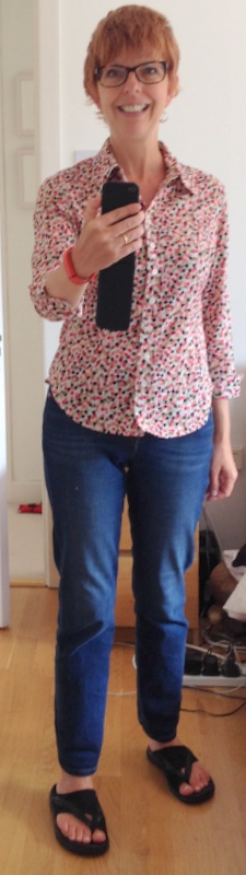
And I'm starting to recognise myself in my self portraits! This one was quite a breakthrough. When Koosje Koene referred to selfies, I always thought she meant self-portraits, but last week, her Draw-Tip Tuesday video made it a lot clearer for me! Can't wait for the next instalment of this lesson!

Wednesday, July 29, 2015

Label Printer


Objects are not as forgiving as fruit and vegetable! A very wobbly-looking label printer! If I was to draw it again, I wouldn't add the cross-hatching in the round shape on the left. It pushed the shape back in and drew attention to a few wobbles.

But never mind all that. I love my little label printer. It was a customer of ours who introduced me to label printers - she is the owner of a local delicatessen, and she prints a lot of labels for their range of take-away dishes. I always felt that handwriting envelopes didn't look professional. But I struggled with printing directly to envelopes - I always ended up inserting the envelope the wrong way into the printer chute and wasted a lot of good-quality envelopes. This great little label printer solved all my problems. And I'm still on the first roll of label paper!

Tuesday, July 28, 2015

The Figure in Movement


This one is my favourite - the workshop facilitator said that if I run out of space for the legs/feet, just to add another piece of paper at the bottom and to continue drawing. I feel I've learnt something new!

Banana Bunch


It didn't really look that realistic until I added the colours (plain old pencils). Fair Trade. Organic. Tasty. And Good for You.

Monday, July 27, 2015

The Figure in Movement

Longer drawings are harder for me - as you can see, I just run out of paper. I need to measure! I think the facilitator said that the standing body is about 8 heads high. Or was that 9? I've just found a website that I'm going to study in detail!

But at least the blue drawing has a head that's not too small (unlike her arms)!

More to come


Figure in Movement - 1-minute drawings


I love one-minute drawings - no time to think, no time to measure. Just let it go!

Sunday, July 26, 2015

Little Book of Calm


I love the quotes from this little book so much that I incorporate them in my Documented Life Project pages every week!


Saturday, July 25, 2015

Poppies


Another old watercolour that I've revisited with a glaze of gouache. I can't seem to find an original photograph, but this post contains a similar one.

Ah here we go, I found it - and realise that I've got it upside down here. Which I quite like.

Invisalign


3 weeks gone. Another 25 weeks to go!

Friday, July 24, 2015

Spot the difference

Spot the difference


I had been curious how John Lovett achieved this dreamy quality to his watercolours. I finally had the time to explore his techniques a little bit more (check the Techniques section on his website). The idea that interested me the most was how to apply a gouache wash over certain areas of a painting to push them into the background, therefore letting the focal point shine through.

I didn't want to ruin a shiny new painting, so I dug up a really old one (from 2011), Little House in the Prairie, and I applied a thin glaze of well-diluted gouache. I had to apply three glazes to get closer to the effect I wanted. 

I must also explore what John Lovett says about making soft edges for my Tara Hill watercolour - basically introduce some variety - not all hard edges or all wet in wet.

What I'm wearing today - between 2nd and 23rd of July 2015

Boden Denim Skirt
Boden belt

Boden top
Boden trousers
Scarf (gift)
Sketchers runners

Jeans - Zara?
Hobbs shirt (really really old. I used to wear it in IBM whenever we had a VP over)

M&S tshirt
Red Monsoon cardigan (really really old)
Really Really old Next scarf
Levi's Outlet jeans
Sketchers

M&S T-shirt
Really Really old linen trousers
Muji cardigan
Clarks shoes

Boden tunic
Boden leggings
Clarks shoes

Toothpaste


Toothpaste tube and toothbrush holder - not quite so intimidating. Although, they look a bit squat, don't they? And I swear I measured!


Thursday, July 23, 2015

Tara Hill, Ballymoney, Co. Wexford


  • Darks are Hooker's Green + indigo
  • Greens are cobalt blue + aureolin yellow (and a touch of burnt sienna in places)
  • The Sea is a lighter version of one of the greens
  • The Sky is cobalt blue
  • The clouds were lifted from the cobalt blue with kitchen paper
This is just a small little exploration of the theme, in preparation maybe for a larger painting. I've done a few thumbnail sketches, but I think I need to go back to the drawing board in terms of composition. This is how it looked, from half way up the hill, and the light was gorgeous, but I need to manipulate the shapes to give it a bit of oomph . 
  • First I need to decide on a "What" (a focal point) - I can't decide what I liked best about the view - the sky, the sea or the fields? Perfect candidate for trying three different versions!!
  • Second - manipulate tonal contrast better - the greatest contrast (light against dark) should be near my focal point
  • Finally, I would like to introduce more texture near my focal point - not sure how yet
Time to look back to one of my favourite art books: Powerful Watercolor Landscapes, by Catherine Gill.


Wednesday, July 22, 2015

Scissors


Another object that I've been intimidated by - Scissors! Maybe it's because I still hear my mother's voice telling me to be careful, as these are sharp, dangerous objects!

I struggled with the round bits (I'm sure they have a name - the handles? Probably not) - how do you render these in a line drawing? I must go back to Koosje Koene's DrawTip Tuesdays to see how she handles the handles!

Tuesday, July 21, 2015

Glasses


I've always been intimidated by glasses - drawing glasses, I mean. All these round shapes, the outer edge, the inner edges, the bits that look bigger or smaller because of the thickness of the glass. 
You may have noticed that I rarely draw selfies with glasses on.

These are my old glasses. They came in handy when I broke my newer ones recently. As far as I can see, the prescription is identical, so I was lucky, as this was just one day before our holidays! But I am glad to have my regular glasses fixed.


Monday, July 20, 2015

Libellules

Love my dragonfly stencil from ArtistCellar (Traditional Japanese Series).

I created the background with my Gelli plate - a few layers of yummy reds and purples (two of them metallics from Dealz - I love their metallic acrylic range). After it dried thoroughly, I dabbed golden and bronze acrylic paint over the dragonfly stencil - with a makeup sponge - the best way to avoid bleed.

I must make more of these - I think they make pretty birthday cards, don't you agree?


Sunday, July 19, 2015

Exploring the Corbières landscape - watercolour and pastels

I sometimes use pastels over failed watercolours. This is a prime example. Having spent most of the weekend labouring on this watercolour, it just didn't work out. But I didn't have the heart to throw it out.

My original plan was to create an abstract rendition of the Corbières landscape which I had sketched earlier in the week. It's a small little sketch, about 10 cm wide. I knew it would be hard to reproduce it's freshness in a larger format.


Instead of using ink for the dark shapes, I used indigo and burnt sienna watercolours. And I was happy enough with how it looked. But I hadn't thought out how I would incorporate the colours above and below. Rule number 1 of watercolours is to start with the lights and finish with the darks. 

I didn't take any photos of the resulting watercolour. It wasn't pretty is all you need to know.
So out came the stanley knife. And the box of pastels.  Much more interesting.

And a few close-ups. I might use these as inspiration for a bigger painting


Saturday, July 18, 2015

DLP June 6 Challenge - Illustrative Art Journaling and Travel Journaling - the end product

Well, not quite the end product. I have a couple more elements to add. But this is how I decided to tackle this challenge.
I started with a really dark page. Then I covered it in gesso, bits of paper (a page from a brochure, a paper invoice on which I wrote a list, and some yummy underpaper) and some off-white acrylic paint.
I used a coral stencil from ArtistCellar for my borders
I added my holiday dress with washi tape.
Added a few quotes and words from my week. In retrospect, they would have been better with an oval frame rather than squares. But I'll survive.


Friday, July 17, 2015

Thursday, July 16, 2015

Figure Drawing in Colour III


I struggle with proportions. And faces. And composition. But I love my colour choice.